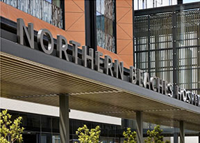
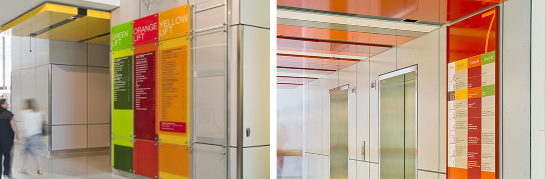
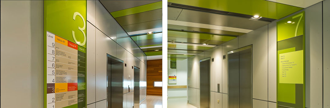
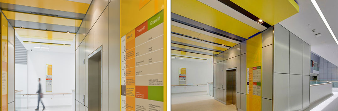
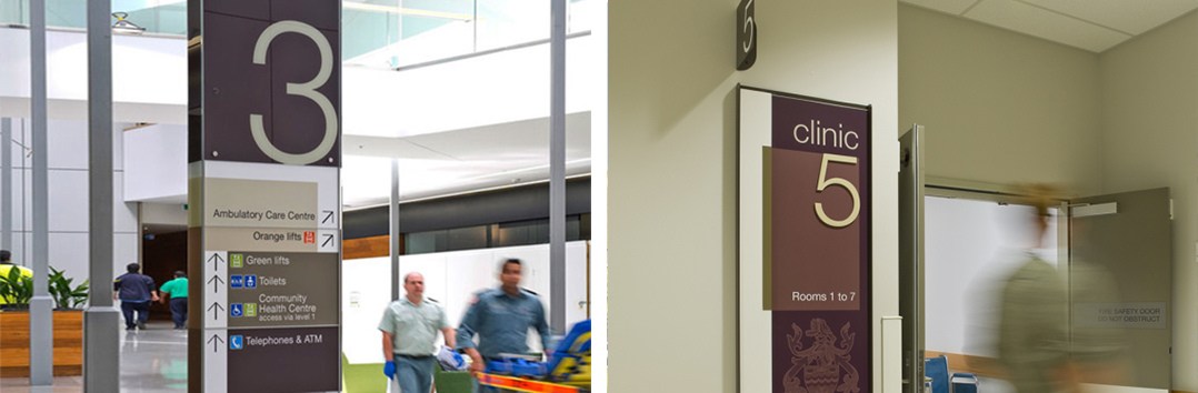
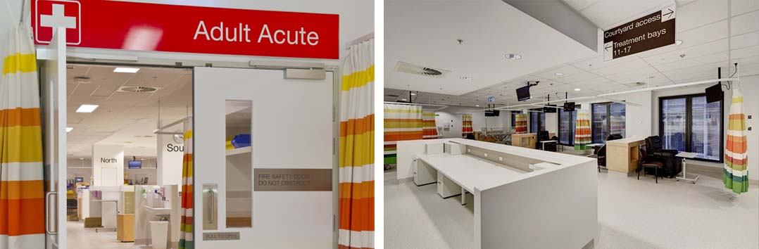
一脉讲评:悉尼皇家北岸医院,把医院标识系统分色分区分号运用到医院空间里,特别是在颜色的划分中,尊重色彩为病患带来的体验,到了极致;
并且在标志的题量上讲究了空间的比例和尺度,使其成为空间和谐的一部分,真正起到了标识为民服务的引导识别功能,张扬且随性的表现了作为设计功能产品,在空间中应有的作用不偏不倚,明确作为医院的受众群,在诊疗的过程当中,引入辨识究竟需要的是什么来承载它的使命;值得我们国内从业者很好的学习借鉴;
免责声明:
本章节文字配图无必然对应关系,图片源自公开网络资源,版权创作归属于原始权利人;本转载旨在优化阅读体验促进业内共享与交流,仅作装饰或辅助理解,本司声明无意且非商业盈利,不作为事实争议依据;若认为图文侵害知识产权,请通过留言或邮件提交书面权属证明即删;
Disclaimer
There is no inherent correspondence between the text and illustrations in this chapter. All images are sourced from public online resources, and their copyright and authorship belong to the original rights holders. This reproduction is intended to optimize the reading experience and promote industry-wide sharing and communication. The images are used solely for decorative purposes or to aid understanding. Our company declares no intent for commercial profit, and the content shall not serve as evidence for factual disputes. If you believe the text or images infringe upon intellectual property rights, please submit written proof of ownership via message or email, and we will promptly remove the relevant content;


中国·上海市闵行区联航路1818弄55号2-3层
yimai-ad@vip.163.com
沪ICP备17020180号-1 Copyright 2014 Shanghai Yimai DesignAll Rights Reserved